Hassle-free medication refill
Role: Staff Designer
Focus: Product Strategy, Research and UX
Challenge: Within months of the app launching the Prescription feature, we noticed a few points of friction within the refill process. These areas affected how veterans and caregivers accurately used the tool, and had the potential to cause decreased engagement due to frustration.
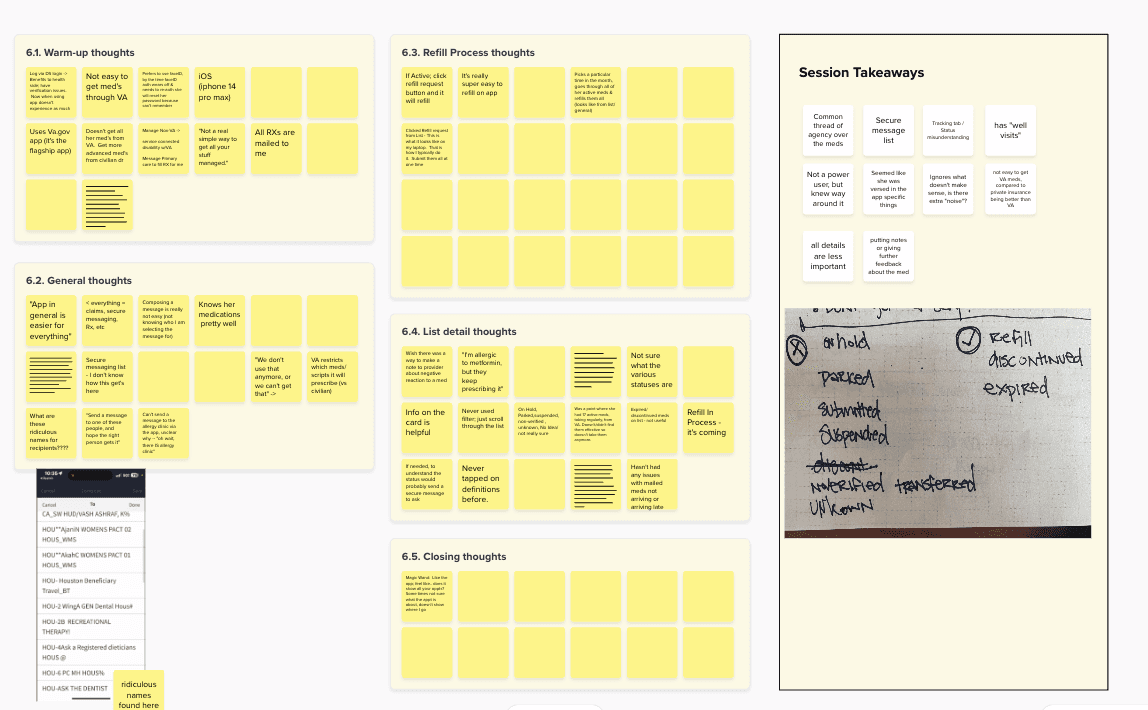
Research session insights
My Role
I worked with the team’s researcher and data analyst to develop a full understanding of the problem, and validate our hypotheses. I presented the data to VA stakeholders so they would feel comfortable with our post-launch revisit.
I recruited the feature’s frequent users for a research study where they conducted refills and walked through how they manage their medication inventory with the app. I aimed to uncover opportunities to ease my hypothesized pain points in areas like layout and content design.
Process
Fostering a trauma-informed practice
Before the sessions, I worked with other researchers and VA social workers to review the test plan, and prepare for potential situations that may arise. In the sessions, I incorporated trauma-informed principles when working with study participants.
I conducted studies with blind/low-vision users for insight on how to improve the feature’s accessibility. I provided study variations to participants, such as a diary discussion opposed to screen sharing and recording while they refill.
A few participants volunteered information about sensitive topics related to their health, so I used trauma-informed principles to ensure that participants weren’t harmed by the study. Additionally, I offered space for other observers to debrief after the session.
Research hypothesis
Leading up to the study, I reviewed usage data and conducted my own heuristic evaluation to develop hypotheses. I noticed that the medication list included potentially confusing or irrelevant statuses, like “On Hold, Parked, Discontinued, Expired”.
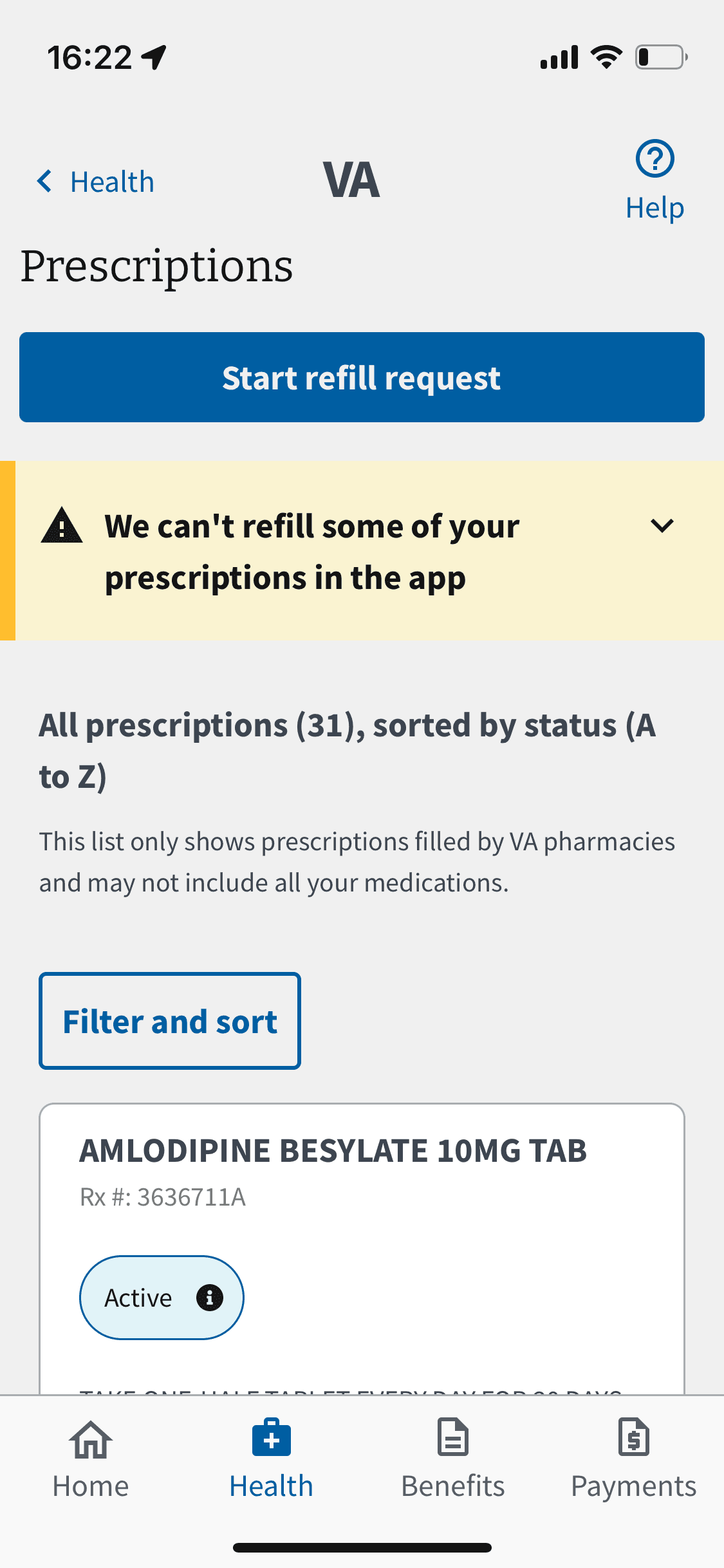
I also noticed the amount of competing interactions on the screen. The initial implementation included a horizontal scrolling tab navigation, and another row of filter buttons below it. Including all of the functionality at the top masked the prominence of the primary action–the Start Refill button.
I questioned which functionality was most valuable to users, since these actions occupied so much space on a smaller mobile device screen. To support my assumptions leading into the study, I paired with the team’s data analyst to validate usage stats and apply meaningful metrics to these potential issues.

Initial design (left); improved navigation post-launch, post-research
Research outcomes
Quantitative data suggested a high bounce rate without refill, and it was underscored when observing the study participants. They became frustrated when trying to locate a particular prescription. They also exclusively looked for the meds with an Active status tag on them.
During the study, all participants successfully refilled their prescriptions–eventually. Other usability issues caused some to explore another refill method, like calling the pharmacy or using legacy tools. These options were in direct conflict with VA’s KPIs–fixing it posed a huge opportunity to improve overall satisfaction with VA services.
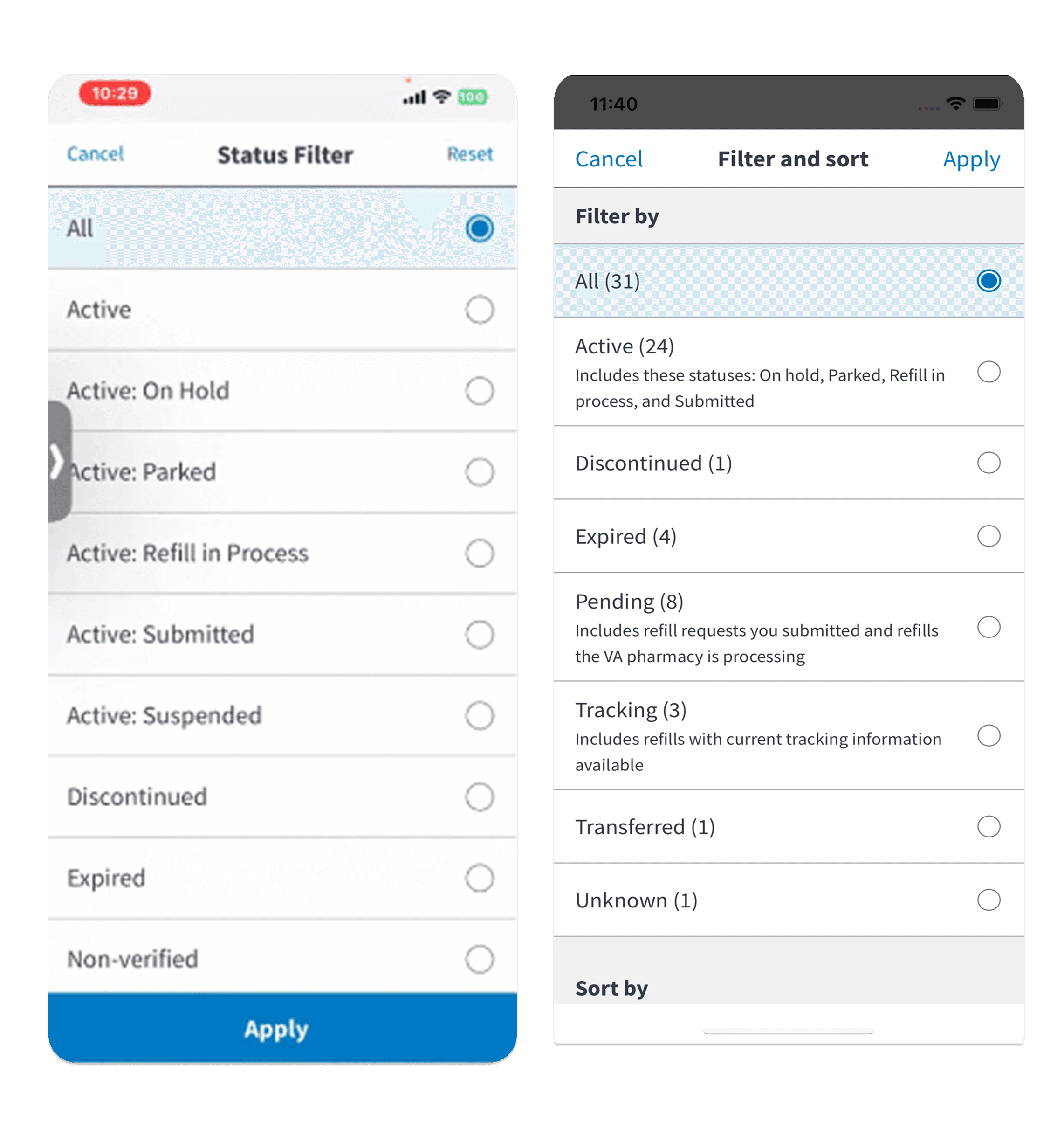
Initial Filter list (left); improved Filter and Sort methods
Results & Next Steps
Upon study completion, I presented the findings to VA stakeholders, and other legacy teams working on software within the Veterans Health Administration. I balanced user feedback and business constraints to develop a prioritization framework to update the Prescriptions feature.
Things that came up
Decentralized data across various VA medical centers caused APIs to retrieve duplicative medications. Some lists had the same medication and dosage listed many times, causing Veterans to endlessly scroll to find the needed prescription–often leading to task abandonment.
Prioritization
Using Agile methodologies, I worked with the product team to plan for the updates alongside other work. This made the work actionable for engineers and relevant to users, without conducting an entire overhaul. I categorized them as follows:
Now
Sort the list by Active status so they appear first, opposed to alphabetizing the list by medication name and useless statuses.
Increase the size of touch targets to ensure successful taps
Simplify the Filter interaction in the absence of the ability to clean the data
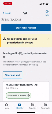
Remove tab navigation to reserve the top part of the screen for the primary action
Next
Work with upstream services and medical centers to clear duplicative records–affecting all VA prescription tools.
Redesign the medication list items, to shorten the list. Reserve the rest for the detail screen.
Later
Offer plain language solutions for content throughout the feature.
Directly send refill or renew requests from related features, like Secure Messaging and Appointments.
Overall Impact
Including clients and external stakeholders in the research study resulted in resounding support for the updates. Since they saw usability issues in real time, it helped them understand the value in what we proposed. We also incorporated a monitoring phase for the events where we witnessed friction. Combining data with research helped me collaborate with legacy VA teams to influence data-driven improvements to their tools.
contact
Colophon
IBM Plex Sans
Merriweather
Nathana Reboucas for Unsplash
Sydney Rae for Unsplash

© 2024 -
Lauren Russell